

Stop Making Charts for Everything
Here is how to know when a table does the job better.

Not every piece of data needs to be visualized
I know, I know. We are always told that visuals are king.
“Make it visual.” “People do not read tables.” “Charts are more engaging.” And yes, most of the time, that is true.
But sometimes a table is exactly what you need.
Let me explain.
Everyone Loves a Good Chart (Maybe Too Much)
If you have spent any time in data, or taken a data bootcamp course, you have heard this idea many times. Charts and graphs are the best way to share insights.
Bar charts, line charts, pie charts (okay, maybe not pie charts), scatter plots. We are trained to reach for a chart first.
Charts are great. They help people see trends at a glance. They make it easy to compare values and spot patterns without reading a lot of text. A good chart can tell a story in a few seconds.
But here is the key point. Charts are not always the answer.
When a Table Beats a Chart
Let us look at the moments where tables shine.
1. When you need exact numbers
Say you are looking at product spending. A bar chart tells you that Wines has the highest spend. Good.
But then someone asks, “How much did we spend on Meat?”
With a table, the answer is easy. They look once and see 165.3 dollars. Done.
With a chart, even with labels, they may squint or guess. That slows them down.
Look at the Product Mix Analysis example. The table is clean and clear. In one glance you see the product name, the average spend, and the percent share.

2. When you have more than one number per row
Now look at the Customer Conversion by Campaign example.
Six campaigns. Two numbers for each one. Accepted Customers and Acceptance Rate.
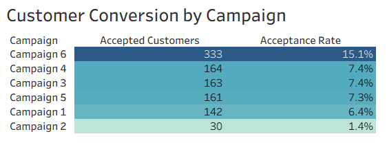
You could make two charts. One chart for accepted customers. One chart for acceptance rate. Now your reader has to look in two places to understand one idea.
Or you can use a table. Everything is together. Easy to scan. Easy to compare.
3. When your audience wants to dig in
Not every stakeholder wants only a big picture view. Some people like the raw numbers.
Analysts, finance teams, and technical staff often prefer tables. They want to explore the data, cross check values, or copy the numbers into another tool.
For them, a table is not boring. It is useful.
But wait, charts are not bad
I am not against charts. Charts are very valuable. They are great for stories, for trends over time, and for helping non technical people engage with the data.
Most tools now let you add labels to charts with one click. So you can keep the visual punch and still show exact values.
For example, you could turn the Product Mix table into a horizontal bar chart with labels on each bar. You would see the size of each product and also the exact dollar amount.
So charts are not bad at all. They are just not the only option.
It All Comes Down to This
The “table vs chart” debate is not really a fight. It is about picking the right tool for the job.
Ask yourself:
What does my audience need right now? A quick picture or exact numbers?
What story am I telling? A trend over time or a clear comparison?
How will this data be used? Fast decisions or deeper analysis?
If your audience needs to spot patterns fast, use a chart.
If they need exact values and details, use a table.
If they need both, give them both. Put a chart at the top for the story and a table under it for the details.
There is no rule that says you must choose only one.