

Stop Using Dual Axis Charts (Unless You Read This First)
The truth about one of data viz's most controversial topics

If you work with data, you have probably had this debate.
On one side, you have the data purists, like Edward Tufte or Stephen Few. These are the experts who make the rules. They will tell you that putting two different numbers on the same chart (a dual axis chart) is a data crime.
On the other side, you have your Boss. They usually say something like, “I just want to see Revenue and Win Rate on the same slide. Just put them together!”
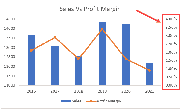
Dual axis charts are those charts where you have two different scales on the left and right sides, usually with lines that dance across each other in ways that look... let’s say interesting.
So, who is right? And what should you do?
The Problem with Two Scales
Before we decide if these charts are good or bad, let me show you why people argue about them.
The Crossing Lines Trick
You know when two lines cross each other on a chart? Your brain automatically thinks something important happened there. Like one thing finally beat the other thing.
But that crossing point might mean nothing.
Since each line has its own scale, you can make them cross wherever you want. Change one scale from 0 to 100 instead of 0 to 1000, and boom, the lines cross in a different spot. Or maybe they don’t cross at all anymore.
It’s like magic, but the bad kind that tricks people.
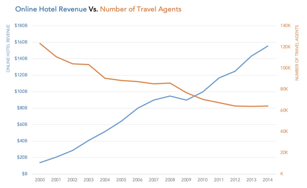
The Size Lie
Here’s another trap. Dual axis charts make it really hard to tell how big things actually are.
Imagine a chart showing how much money the entire world makes (trillions of dollars) next to how much money is in your bank account (maybe a few thousand dollars).
If I put both on a dual axis chart, I can make your bank account look just as impressive as the world’s economy. The lines can grow at the same angle. They look equally important.
But we both know that’s ridiculous, right? Your savings and the world’s GDP are not the same thing at all.
This is why people say these charts are dangerous. You can stretch and squeeze the scales to tell whatever story you want.
So now you can see why people don’t trust these charts.
Okay, So Should You Use Them or Not?
I’ve noticed after seeing tons of these charts that about 95% of them are confusing or misleading.
Not always on purpose. Sometimes people just want to fit everything on one slide. Or they think it looks cooler. Or they genuinely believe the two things are related and want to show that.
But most of the time, two separate charts would have been clearer.
The tricky part is knowing when you’re in that 5% where a dual axis chart actually helps.
When They Actually Work
Okay, so they’re not always bad. Sometimes they actually make sense. Here’s when:
The relationship IS your whole point. Like “when we spent more on ads, our conversion rate went down.” You’re not just showing two trends. You’re showing how they move together. The connection is the story.
The units are totally different anyway. Like temperature and rainfall. One is degrees, one is millimeters. Nobody expects those to share a scale. But here’s the catch: you MUST color code everything. If your temperature line is red, make the left axis labels red too. If rainfall is blue, make the right axis blue. Without these color clues, people get confused fast.
You’re being honest with the scales. You’re not stretching one axis way up and squishing the other way down just to force a visual connection that doesn’t really exist.
Your audience can handle it. They know how to read charts carefully and check the axis labels, not just look at the pretty lines.
It’s a standard format people recognize. Like a Pareto chart with bars showing counts, and a line showing the running percent as you go. People in business know how to read these already.
What Should You Do Instead?
This is where it gets practical. Let me give you better options that work most of the time.
Small Multiples (My Favorite)
Just make two charts and stack them on top of each other. They both use the same time line at the bottom (x-axis).
It works because you can still see if things go up or down together. Your eye naturally compares them. But you’re not messing with scales or tricking anyone.
Scatterplot for Real Relationships
If you really want to show how two things relate to each other, use a scatterplot (a dots chart).
It directly shows the connection. You can actually see if there’s a pattern or not.
Indexed Charts
Turn both numbers into a starting point number. Like “100 equals our starting point.” Now they’re on the same scale and you can compare them fairly.
This still has some issues, but at least you’re being upfront about what you’re doing.
Two Separate Charts
Sometimes the easiest answer is the best one. Two clear charts often beat one confusing chart every single time.
Here's What I Think
Look, I’m not going to tell you to never use dual axis charts. That would be too simple.
But I will say this: if you’re thinking about using one, pause for a second.
Ask yourself: “Am I using this because it genuinely tells the story better? Or am I using it because I want to fit more stuff on one slide?”
Most of the time, the two separate charts will win.
The goal isn’t to make charts that look impressive. The goal is to help people understand your data quickly and correctly.
If a chart makes things more confusing, even if it looks cool, it’s not doing its job.
Really well put. Most of the time the “one slide” solution just creates more questions than it answers. Small multiples almost always read cleaner.