

The Bar Chart Mistake Most Analysts Make
What grouped, stacked, and 100% stacked bar charts are actually built for

One of the most common mistakes analysts make is choosing a bar chart based on how it looks.
A grouped bar chart looks detailed. A stacked bar chart looks compact. A 100% stacked bar chart looks neat and balanced. So people often choose the one that feels right visually.
But that is the wrong way to choose.
The best chart is not the one that looks the nicest. The best chart is the one that helps the reader compare the right thing.
Grouped bar charts, stacked bar charts, and 100% stacked bar charts may look similar because they all use bars. But they do not do the same job.
When you use the wrong one, your chart may still look good, but the message becomes harder to understand.
What A Bar Chart Is Actually Supposed To Do
A bar chart is not just there to show numbers. Its real job is to help people compare things.
That sounds simple, but it changes how you think about chart choice.
Before you pick a chart, you need to ask one simple question: what should the reader compare?
Should they compare one category against another? Should they compare how smaller parts add up to a total? Should they compare the percentage share of each part?
Those are different questions. And each one needs a different type of bar chart.
Grouped Bars Make Comparing Easy
A grouped bar chart is best when you want to compare values side by side.
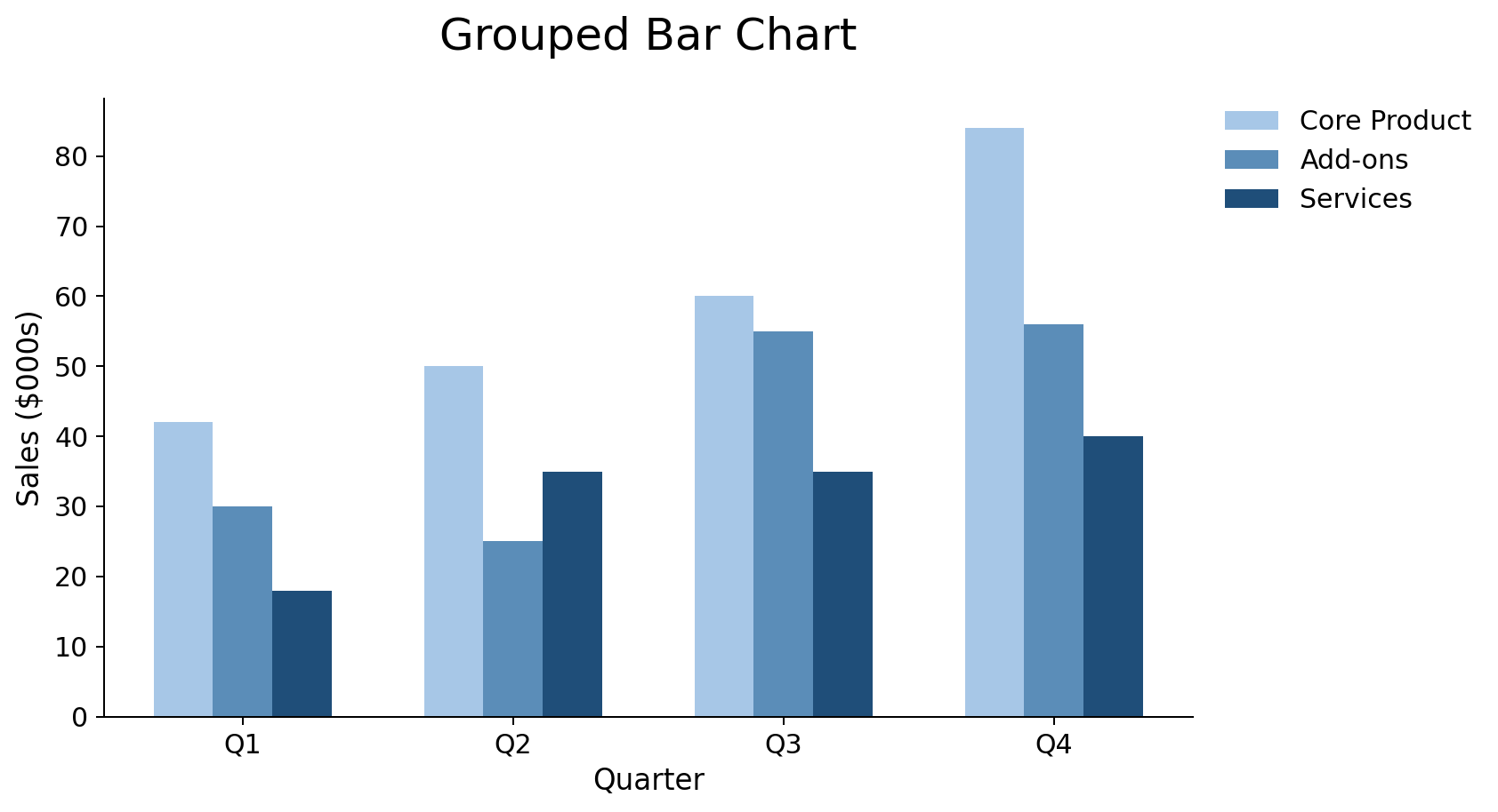
In this chart, bars sit beside each other in small groups. This makes it easier for the reader to compare their heights. The bars all start from the same flat line at the bottom, so your eyes can quickly see which one is taller.
For example, let’s say you are comparing sales for three products across four regions. A grouped bar chart can work well because the reader can look at each region and compare the products beside each other.
This type of chart helps answer questions like: Which product sold more in each region? Which region performed best for each product? How do the products compare within the same group?
But grouped bar charts can also become messy fast. If you have too many groups, or too many bars inside each group, the chart becomes crowded. The reader has to keep checking the legend, looking back at the bars, and trying to remember which color means what.
At that point, the chart is doing too much.
A grouped bar chart works best when the comparison is simple. A few groups. A few bars in each group. Clear labels. Easy reading.
Stacked Bar Charts Show The Total And The Parts
A stacked bar chart is better when the total matters.
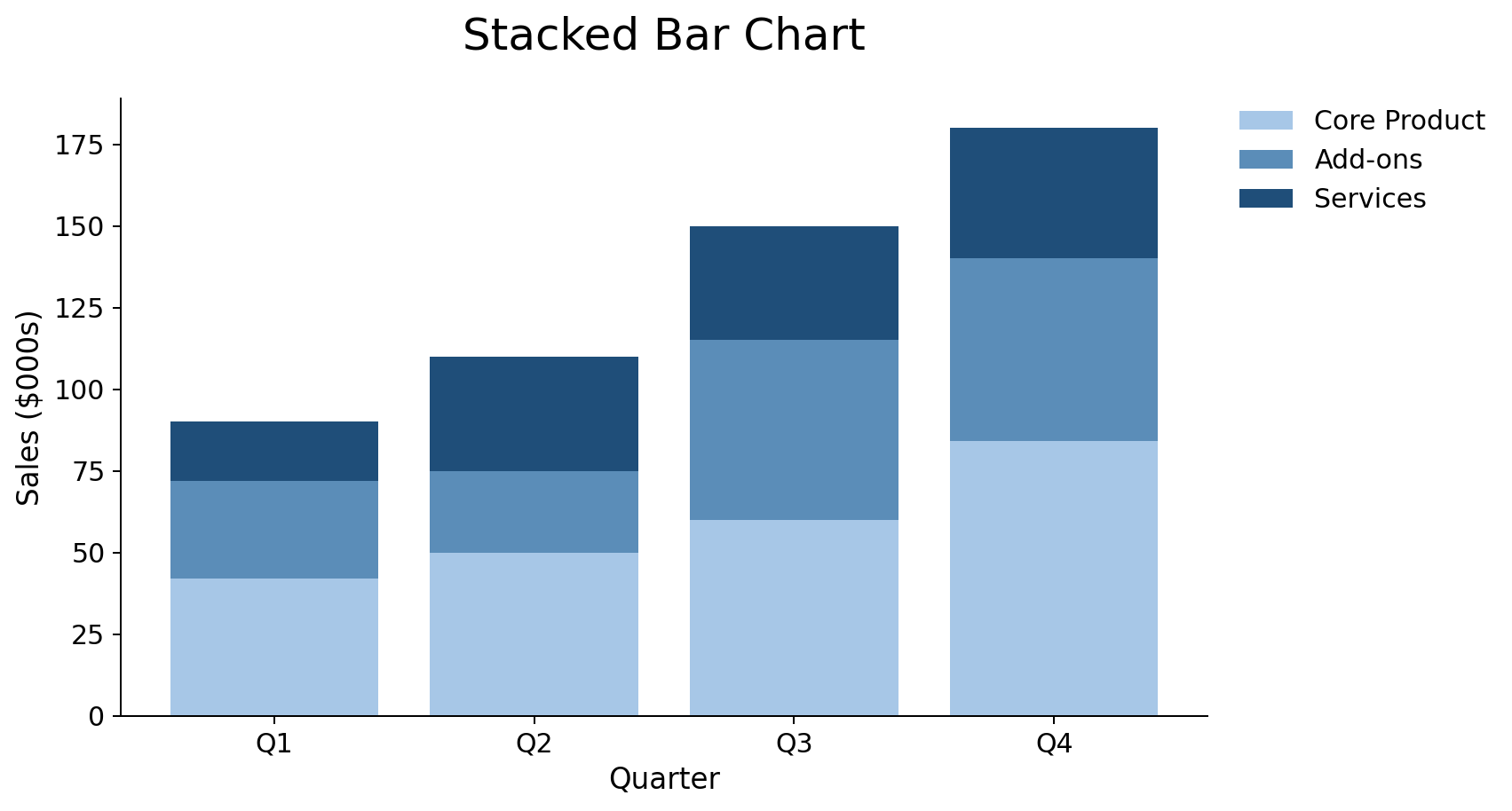
Instead of placing bars side by side, a stacked bar chart places smaller bars on top of each other. Together, those smaller pieces form one full bar.
This makes the chart useful when you want people to see the total amount and also understand what made up that total.
For example, let’s say you are showing monthly sales, split by product type. A stacked bar chart can help the reader see total sales for each month. At the same time, the colors inside each bar show how each product type added to the total.
That is useful when the story is about both the big picture and the parts inside it.
But stacked bar charts have a weakness. They are not great when you want people to compare each piece closely.
The first part of the bar is usually easy to compare because it starts on a flat line. But the blocks in the middle or at the top do not start from the same place. This makes them harder to compare with the eye.
So if you want the reader to compare Product B across five months, a stacked bar chart may not be the best choice. Product B may sit in the middle of each bar, and each piece may start from a different point. The reader now has to work harder to compare them.
That does not mean stacked bars are bad. Use them when the total matters and the parts are there to support the story. Do not use them when the main goal is exact comparison between each part.
100% Stacked Bar Charts Show Share
A 100% stacked bar chart looks like a regular stacked bar chart, but it does something very different.
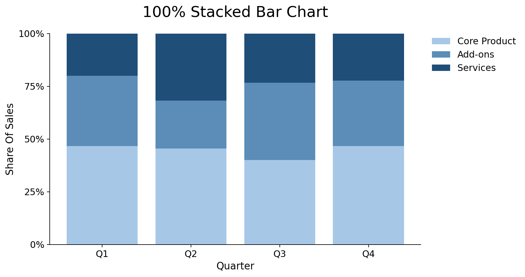
In a normal stacked bar chart, the full height of the bar shows the actual total. A bigger bar means a bigger total.
In a 100% stacked bar chart, every bar has the same full length. Each bar represents 100%. The pieces inside the bar show the share of that total.
This chart is useful when the total size is not the main point. The focus is the mix.
For example, let’s say you are comparing traffic sources for three websites. One website may have 10,000 visits. Another may have 100,000 visits. But maybe your goal is not to compare total visits. Maybe your goal is to compare where the traffic came from.
In that case, a 100% stacked bar chart can help. It can show what share came from search, social, email, or paid ads.
This chart helps answer questions like: Which website depends more on search? Which one gets a higher share from email? How does the traffic mix change across websites?
That is where 100% stacked bars are useful. They help people compare shares.
But they also come with a risk.
Because every bar is the same length, the chart can hide the actual total. A small group and a large group can look equal, even when they are not.
That can be dangerous when the total size matters.
For example, 50% of 100 customers is not the same as 50% of 10,000 customers. The percentage is the same, but the meaning is very different.
So use 100% stacked bar charts when the share is the main message. Avoid them when the actual total is important to the decision.
Choosing Well Is A Communication Skill
Picking the right chart is not just about knowing the tool. It is about helping people understand.
It means you are thinking about the person who will read the chart. It means you are asking what they need to understand first. It means you are choosing what is clear over what you always do.
If you use a 100% stacked bar chart when totals matter, the reader may miss that one group is much larger than another.
If you use a stacked bar chart when people need to compare each part, the reader may struggle with the middle sections.
If you use a grouped bar chart when the total matters, the reader may focus too much on each small bar and miss the bigger picture.
The data does not change when you switch from one chart type to another. But the story can change a lot.
That is why analysts need to slow down before building the chart.
Start with the question.
Then choose the chart.
The chart should follow the message, not the other way around.
In addition to your guidance, why understanding the "simple math" behind visuals (such as a bar chart) is foundational. Speaking as a person who has never liked math😁.