

The Problem With Treemaps
Some charts look smart but slow the reader down. Treemaps are a common example.

Humans are good at comparing length when objects are lined up. That is why bar charts work so well.
If one bar is longer than another, we can usually spot the difference fast.
Treemaps do not work that way. They use area.
That means the reader has to compare one box with another. This sounds easy, but it is not. One box may look bigger because it is wider. Another may look bigger because it is taller. Two boxes can have almost the same area but very different shapes.
So the eye starts guessing.
This is why treemaps can work when one category is huge and the rest are small. The big pattern is clear. But once the values are close, the chart becomes weak.
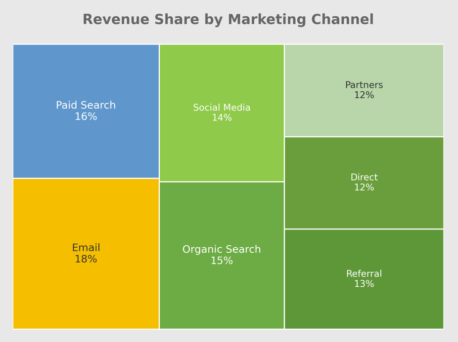
If Category A is 18% and Category B is 16%, most people will not see that difference clearly in a treemap. They may need to hover, check labels, or look at the numbers. At that point, the chart is no longer helping enough.
A chart should not make basic comparison feel like a puzzle.
The Order Is Not Easy To See
Treemaps also make ranking harder than it needs to be.
With a sorted bar chart, the order is clear. The biggest value sits at the top. The next one follows. The reader can see the order before reading every label.
With a treemap, the layout is not always easy to scan. The biggest box may be clear, but the second, third, fourth, and fifth can take more effort. The reader has to move around the chart and compare boxes that may not even sit near each other.
That slows the reader down.
If your main point is “these are the top 10 categories,” a treemap is usually not the best choice. A sorted bar chart may look less exciting, but it tells the story faster.
Small Categories Get Squeezed
Treemaps also have a problem with small categories.
When a few large values take up most of the space, the smaller values get squeezed into tiny boxes. Their labels may get cut off. Some labels may not show at all. The chart still looks full, but the details are no longer easy to read.
This happens a lot in business dashboards. One or two large groups take over the space, while the rest become tiny blocks. At that point, those small blocks only make sense if you hover over them with a mouse.
Tooltips are useful for this, but they should only support the chart, not carry the whole thing.
If someone has to hover over many boxes just to understand the basic message, the chart is not doing enough on its own. A good chart should give the main story without extra digging.
Negative Numbers Break The Chart
Treemaps use area to show size. That creates a simple problem: area cannot be negative.
This makes treemaps a weak choice for data with losses, drops, or negative profit. If a company wants to compare profit and loss across regions, a treemap will struggle because a negative value cannot be shown as a negative box.
Some tools may hide negative values. Some may show an error. Some may force the data into a strange format. Either way, the chart becomes risky.
This matters because many business numbers can fall below zero. Profit can be negative. Growth can be negative. Net change can be negative. Variance can be negative.
If your data includes both good and bad values, use a chart that can show both clearly. A bar chart with a clear zero line is often much better. It can show gains on one side and losses on the other.
That is easier to read and much harder to misunderstand.
Treemaps Have A Place, Just Not Everywhere
Treemaps are not always wrong. They just work best for a small set of jobs.
They can work well when the goal is to explore many groups and subgroups. A common example is storage space on a computer. A treemap can show which folders take up the most space and how smaller files sit inside larger folders.
That makes sense because the goal is not always exact comparison. The goal is to scan a large structure and spot what is taking up space.
Treemaps can also work when one category is so large that the message is obvious. If one product makes up half of total revenue, a treemap can show that pattern quickly.
But that is not how many dashboards use treemaps. Many use them to rank categories, compare close values, or show performance across groups. Those are jobs that need a clean answer, not a visual maze.
Simple Charts Are Not a Step Down
A lot of dashboard problems start when people try to make a chart look more advanced than the message requires.
But simple charts are not lazy. Simple charts often respect the reader more. They save time, reduce confusion, and make the main point easier to see.
If you want to compare categories, use a sorted bar chart.
If you want to show change over time, use a line chart.
If you want exact values, use a clean table.
If you want to show parts of a whole for a few groups, use a 100% stacked bar chart.
If you want to show positive and negative values, use a bar chart with a clear zero line.
These charts may not look as flashy as a treemap, but they help the reader understand the data faster, which is the whole point of sharing data in the first place.