

Your Chart Can't Explain Itself (But It Should)
The simple annotation strategy that makes every chart clearer

You won’t always be there to explain your chart.
You might give a great presentation today. But an hour later, your slide deck gets emailed around. Someone opens it on their phone. Someone skims it between meetings. Someone skips your notes and looks straight at the charts.
Will they understand why sales spiked in May? Will they get why traffic dropped in October?
Probably not.
This is where most charts fail. But there is a simple fix: Annotations.
Charts Don’t Explain Themselves
We like to think a clean chart can explain itself. We think good colors and a clear title are enough.
But usually, context is everything.
A line going up looks like success, until you realize it’s counting customer complaints. A sudden drop looks like failure, unless you know a system outage caused it.
When you’re not there, people usually do one of three things::
They guess the story (and get it wrong).
They waste time hunting for answers.
They ignore the data completely.
You need to leave your voice behind when you’re not there.
Here’s What I Mean by Annotations
An annotation is just text you add directly to your chart to explain what is happening.
It isn’t fancy. It is literally you writing on the chart to make sure people understand what they are seeing. It works like a small road sign. It tells the reader: “Look here. This is important. Here is why.”
Let’s look at how this works in real life.
What Happened vs Why It Happened
Take a look at the image below.
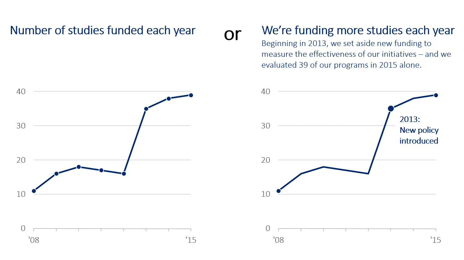
On the left, you see a line chart. It shows the number of studies funded. The line goes up and down, and then shoots way up in 2013.
The chart tells you what happened (numbers went up). But it doesn’t tell you why.
Now look at the right side. Same data. Same chart. But this time, there is a simple note: “2013: New policy introduced.”
Boom. Now you get it. You don’t have to guess. The policy change lines up with the jump. That little bit of text turned a boring graph into a clear story.
The Chart That Almost Caused Panic
Context can stop a misunderstanding. Check out this chart about help desk tickets.
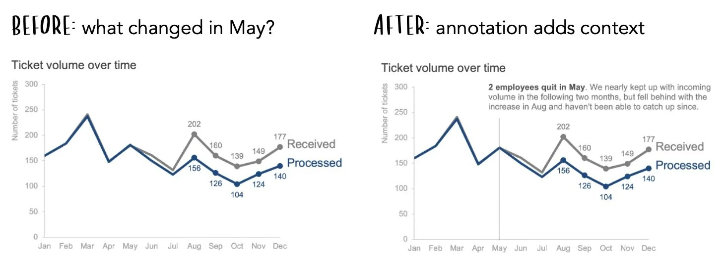
On the left (the “Before” version), you see a gap. The team is receiving way more tickets than they are processing. If a manager sees this, they might panic. They might think the team is lazy or the system is broken.
But look at the “After” version on the right.
There is a direct note: “2 employees quit in May.”
Suddenly, the panic is gone. It isn’t laziness; it’s a staffing issue. The conversation changes from “What is wrong with you?” to “How can we hire people faster?”
Without that note, the data looks bad. With the note, the data makes sense.
When Should You Use Them?
You don’t need to write a novel on every slide. That would be messy. But you should use annotations for the big moments:
Spikes and Dips: Did the numbers jump or crash? Explain what happened (e.g., “Server outage” or “Holiday Sale”).
Goals: If you are trying to hit a target, draw a line and label it “Goal.”
Key Takeaways: If there is one thing you want people to remember, write it right on the chart.
Weird patterns: If something strange shows up in the data, explain it.
Let the chart speak for you
We spend hours making our charts look pretty. But if we don’t explain the data, that work is wasted.
Annotations are your safety net. They ensure your data tells the same story on Thursday morning that it told in Tuesday’s meeting.
So, next time you make a chart, don’t just rely on the legend or the title. Write on the chart. Be the narrator even when you aren’t in the room.
I understand that we have to annotate our charts, but please, I have a question. What if we are building a dashboard, are we going to annotate the charts too or annotation is just for when we have a presentation.
If the answer to my question is yes, won't it make the dashboard look busy?